This project showcases my experience in creating a brand system, and advising the client on how to translate it into a physical space.
Streamline Coffee & Crepes is a fast-casual cafe in Lawrence, Kansas by architecture and interior design firm, Hoke Ley.
Started as a mobile coffee airstream trailer, Streamline wanted a full rebrand for their brick-and-mortar creperie launch.
They asked me to create a brand identity rooted in 1980s nostalgia with a touch of bold irreverence, working with their existing color palette and beloved mascots to create a visual world that felt cohesive and eye-catching on the main thoroughfare of this college town.
I created a design system, custom logos and graphics for multiple applications (including Canva templates), signage, and advised on furniture, fixtures, and materials selections.

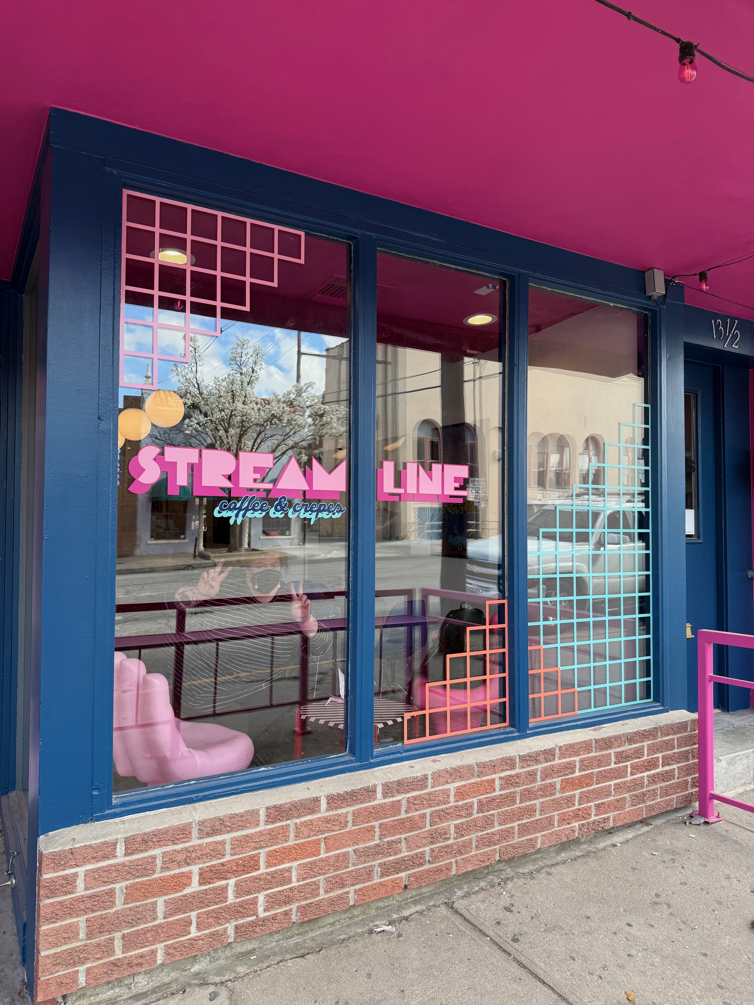
The new logo was inspired by the Pac Man font and hand-drawn. I used a bubbly vintage-feeling font for the sub text, and a heavy drop shadow to harken back to 50s diner window decals as a nod to their former life in an airstream trailer.

During our first kickoff meeting, I presented my understanding of the project scope (jumping in mid-stream there hadn't been much time for a deep dive into the background details) and relevant visual references.

I created a multi-level moodboard for the interiors inspo since they had already started executing this area and were in immediate need of goalposts to anchor aesthetic decisions that the brand could be build around in the meantime.

The team setting up the shop the day before opening. You can see some references from my moodboard - the warm globe lighting, playful lucite seating, grid motifs, and tile with colored grout. My original idea to have a 3D Lightbox signage built above the bar got nixed due to time constraints, so I pivoted and designed something high-impact that could be printed on aluminum quickly.

The client didn't ask for a manifesto but I felt like one was needed since this was such a big visual update for the brand. I wanted to make sure the customer still knew they could expect the same quality of service from this new establishment.

The exterior signage carried through the grid motif brand identity through the bold and playful color choices. The owner said pedestrians could not walk by without stopping and peeking inside in the days and weeks before opening.

The client stressed that customer service was their chief priority - fast and friendly service is in their motto and how they differentiate themselves, which has been their biggest asset in growing a deep base of regulars at their airstream location.

We grounded the aesthetic choices in that optimistic and joyful, community-first attitude.
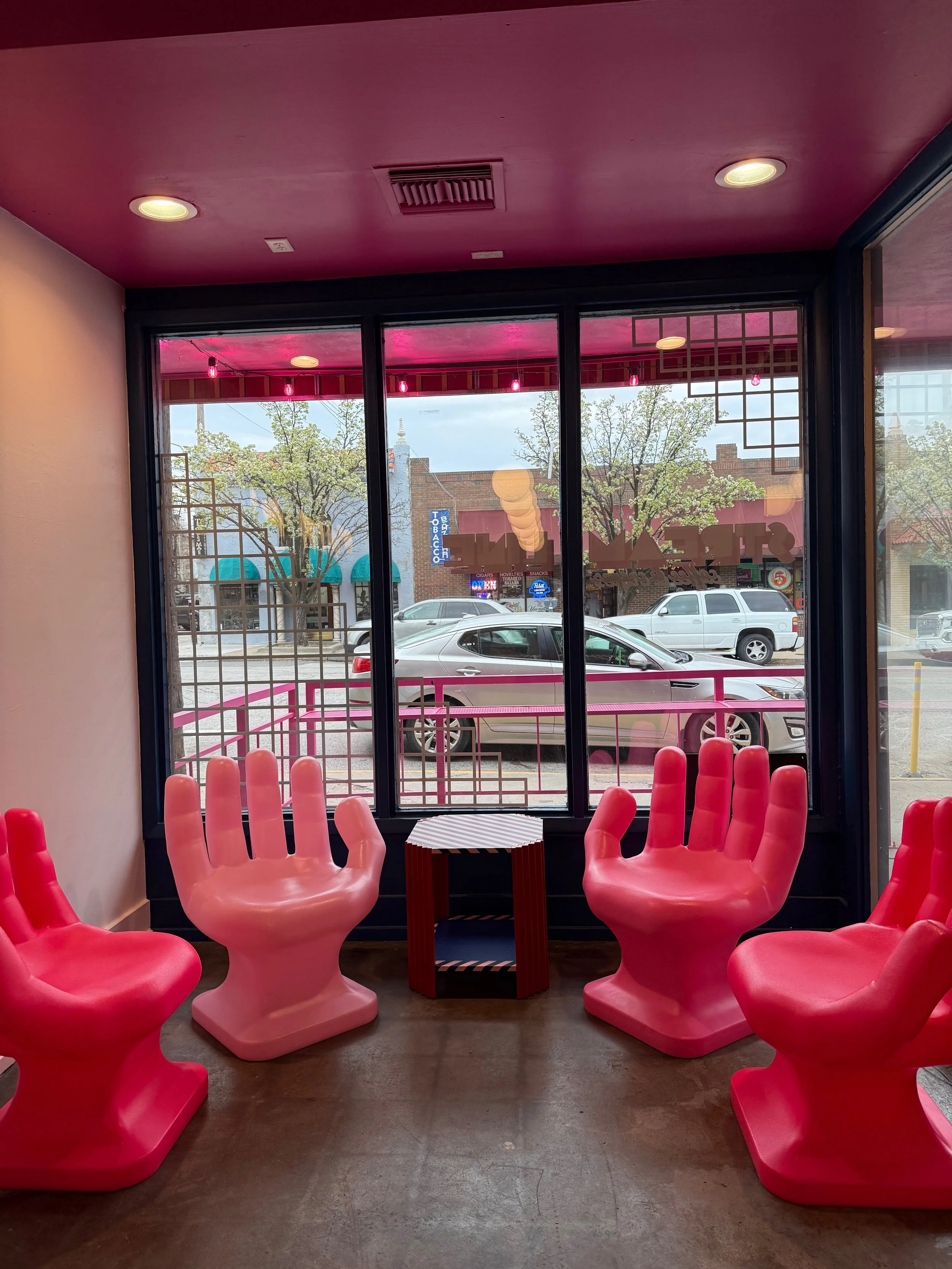
The Hoke Ley team is staffed by some mid-century chair enthusiasts, so the obvious choice for the front feature seating area were these bright pink variations inspired by the Pedro Friedeberg hand chair.

Their original tagline, "Fast - Friendly - Mighty Fine" would still be a mainstay, but I wanted to give them some more tagline options that referenced 80s tunes and felt grounded in modern pop-cultural language.
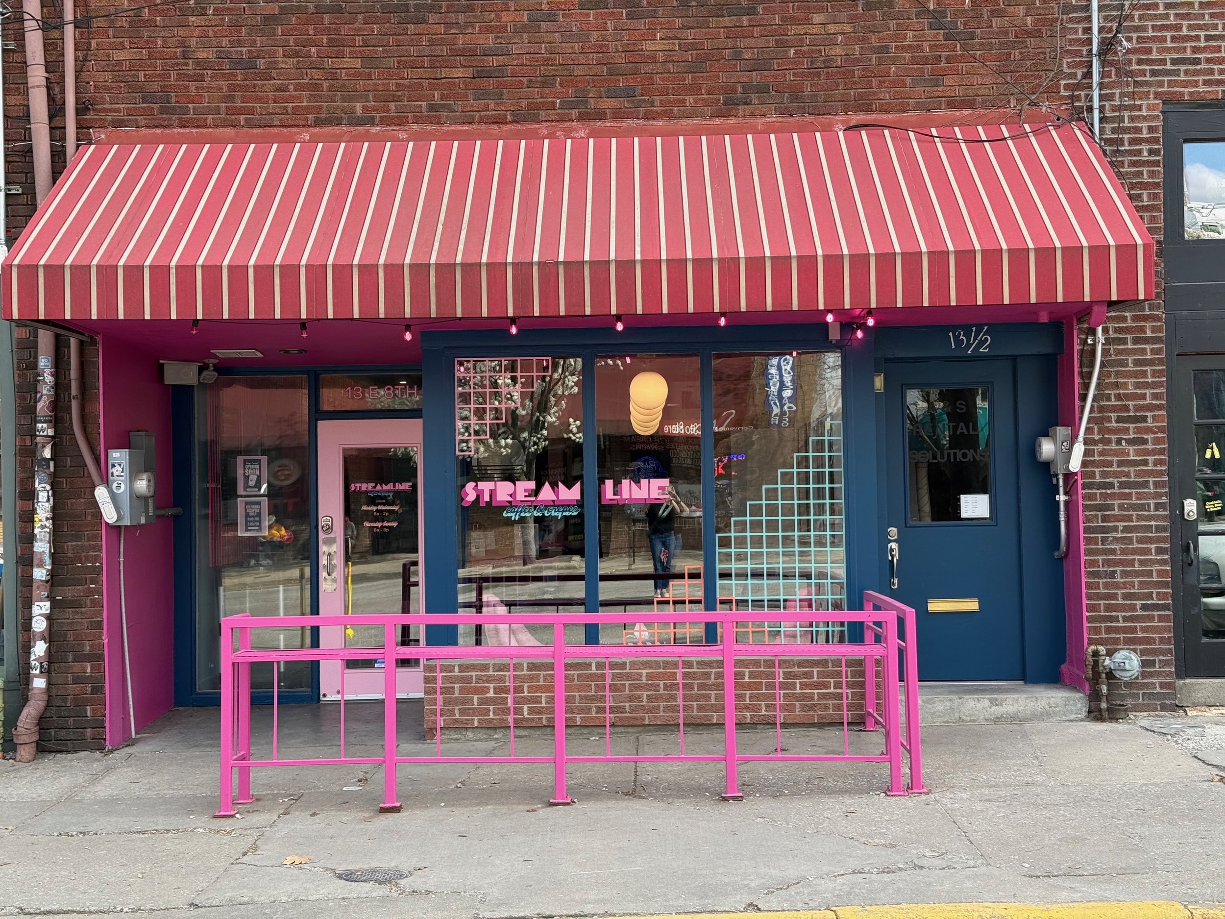
While the lease didn't allow them to change the awning, we were still able to create a striking effect for the building exterior with paint colors and window decals.

The logo was hand-drawn and inspired by the Pac-Man logo, a nod to 80s childhood nostalgia.

View of the coffee bar and ordering area.

The color palette had already been established with pinks and blues when I came in, but I added the creamsicle orange to complement the blues and provide a vibrational contrast to the pinks.

I selected secondary fonts that tied into the 80s theme. Berenica felt like a perfect bridge between the 50s airstream and 80s Memphis styles. Comforting and still playful. GT Pressura was chosen for its easy legibility as a menu or paragraph typeface. A clean san serif that still had hints of play and comfort with its soft edges.

The seasonal menus. Since they change these frequently, I created templates in Canva that the cafe manager could easily update and re-print as needed.

View of the menus location.

The beverage mascots were hold overs from the original branding, but recolored for the new brand system. As crepes were new to the menu, I created a crepe character in the same style.

It was very telling to me that the client wanted to rebrand everything but still keep the original mascots. They said customers loved them and they really set the tone. Because of this, I decided to use a crop of the coffee cup's face as a secondary logo for places where a 1x1 scale was better than our 4x1 horizontal main logo. This is their social media icon, and they also use a smiley sticker for all their cold beverages -- I love that it makes a literal representation of their mascots!

One of their iced drinks with the smiley sticker.

Inspired by my own childhood memories of fast-casual restaurants where the table is covered with a big white paper and the kids given crayons to entertain them during the meal, I dreamed up this one-color repeat print for the food safe paper to present the crepes in. I added a stamp-like effect, to give it a more rustic hand-made feel, which became a signature style for the rest of the food packaging.

My concept for the crepe wrap presentation.

Ideas for reusable and disposable cups.

A test crepe with the full packaging.

Employee uniforms designs, I put the slogan on the back of the shirt since it's a key feature of their customer service, and created an assortment of garments in all the brand colors so the employees could mix and match and still look on-brand.

Embroidery machine working on the aprons.

Designs for customer merchandise showing how the various logos and taglines could be used to reinforce the brand as a sellable item (and second-hand marketing tool).

Employee uniforms hot off the press.